7
Business Writing Trait 7: Design
Strong design in business documents is not about producing a splash or using color for color’s sake. Instead, design needs to serve content. As with every other trait, the goal of design is clear communication, and the only way for design to succeed is for it to make the message clearer.
This chapter focuses first on the basics of designing business documents, including page layout, format, and typography. Then, the chapter shows different types of graphics and how to incorporate them in a document. Last, you’ll find a checklist to help with design.
In this chapter
Design: An Overview
Your goal is to create a page design that is attractive and easy to read and reflects well on you and your company. To achieve a reader-friendly design, use the tips below.
Elements of Document Design
A document design should (1) follow company standards, (2) make information accessible, and (3) look inviting to the reader. Smart choices about format, page layout, and typography will lead to a successful design.
Page Layout
Produce pages that are open, balanced, and readable.
-
Balance your pages with an effective combination of print, graphics, and white space.
-
Introduce headings to separate blocks of text; keep headings consistent in size and presentation (boldfaced, centered, or underlined).
-
Use visual cues (like numbers, bullets, or indents) to help distinguish between main and secondary points.
-
Maintain a ragged right margin unless full justification is required.
-
Do not place headings, hyphenated words, or the first lines of paragraphs at the very bottom of a page or column.
-
Avoid placing single words or lines at the top of a page.
-
Keep all items in a list on the same page.
Typography
Choose attractive, easy-to-read typefaces and type sizes.
-
Select 10–12 point type for regular text, 14–16 for subheadings, and 16–20 for major headings and titles.
-
Choose a readable serif typeface such as Garamond, Georgia, or Times New Roman (like this type).
-
Use sans serif type such as Calibri, Tahoma, or Verdana (like this type) for special text, including headings and on-screen documents.
-
Try special type styles and treatments for emphasis: underlining, highlighting, italics, boxes, UPPERCASE, and color.
Format
Use an appropriate design.
-
Follow the rules for the type of document you are writing (memo, letter).
-
Plan the overall design by considering the number and the width of columns.
-
Consider using graphics.
-
Organize each page by using numbers, headers, lists, bullets, and so on.
Creating Strong Design
The document below is designed simply but effectively. Headings, lists, boldface type, white space, and margins make each part of the message clear and easy to follow.
Family and Children Coalition
Confidentiality Procedures
Lines are a moderate length, flush left, and ragged right. The Family and Children Coalition Confidentiality Policy states that all clients have the right to confidentiality. Conduct your work in keeping with this policy by following the procedures below.
Boldface type is used to draw attention to key information. Client Intakes
During the client intake, the Coalition counselor should discuss conditions of confidentiality with the client. The counselor should explain the following:
-
White space helps break text into readable units.
-
Information will never be shared unless the client has given written permission using the Consent to Release Form.
-
Confidentiality may be limited or canceled if Coalition staff have serious concerns about child abuse or neglect.
Headings and lists separate blocks of text. Outside Requests for Information
Coalition counselors will handle outside requests for client information.
-
No client information will be shared without the client’s written permission.
-
Clients will be notified of any outside requests for information. If the client gives permission, he or she must sign the Consent to Release Form and indicate what information may be released and to whom.
Main text is serif; headings are sans serif. Breaches of Confidentiality
If a client believes that Coalition staff have not observed the confidentiality policy and procedures, he or she should be directed to follow the Client-Grievance Process.
Appropriate margins are used on all sides. By carefully following the procedures above, the Coalition staff can help our clients while also respecting their rights to confidentiality.
Design: Problems and Solutions
You’ve heard that form should follow function. That’s especially true when designing a document. Design’s role is to make communication clearer and more compelling. The following pages outline common design problems and ways to solve them.
Problem:
Every document I create looks the same.
Listen for
“Another boring document.”
“Words, words, words.”
Solution:
Experiment with page design.
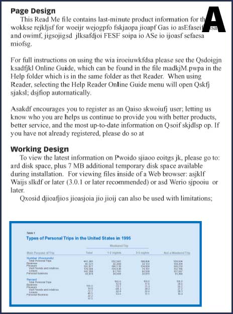
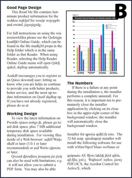
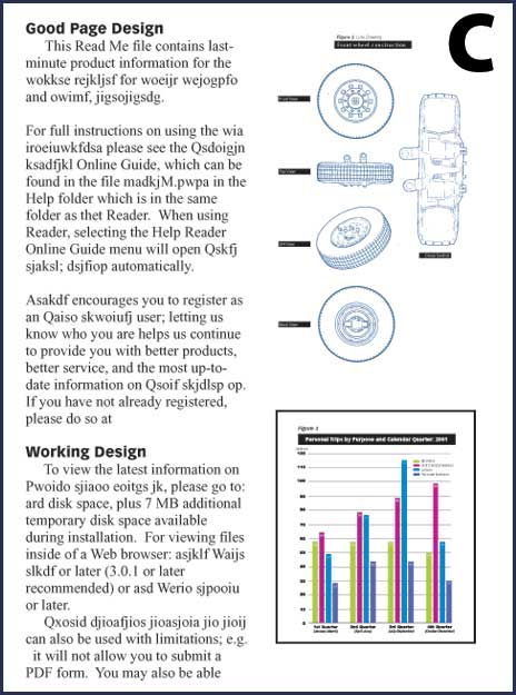
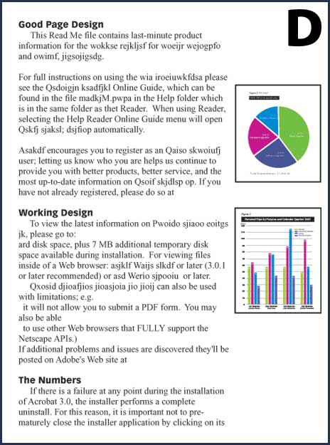
Select an appropriate page design for the document as a whole. Consider the amount of text and the number of graphics you plan to use, and select a layout to balance the two. Choose from the following designs:
-
A single column with a large graphic (A).
-
Two even columns with a small graphic (B).
-
Two even columns, one text and one graphics (C).
-
Two uneven columns, one text and one graphics (D).
Problem:
I’m not sure where to put graphics on a page.
Listen for
“Where’s the figure?”
“What does this table go with?”
Solution:
Place graphics to aid the reader.
Position graphics logically. Insert a graphic close to the first reference to it—preferably after the reference.
-
Place a small graphic on the same page as the reference.
-
Place a large graphic on a facing page in a double-sided document, or on the page following the reference in a single-sided document.
-
Make a less important or a very large graphic an attachment or an appendix item.
-
Refer to the graphics in text.
-
If there are many graphics, consider using a numbering system and including a caption.
Problem:
I need to show a lot of raw data.
Listen for
“There are too many numbers in the text.”
Solution:
Use a table.
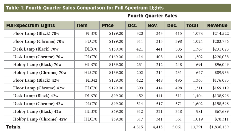
Create a table to arrange raw data in rows and columns, allowing readers to easily compare figures. Use tables to
-
categorize data for easy comparison.
-
provide many exact figures in a compact format.
-
present raw data that are the foundation of later graphs.
Problem:
I don’t know how to set up a table.
Solution:
Use a table maker and follow these tips.
-
Set up rows and columns in a logical order. Make tables easy to read by using patterns of organization: category, time, place, alphabet, ascending, or descending order. Make the columns or rows containing totals clear and prominent.
-
Label information. Identify columns at the top and rows at the left. Use short, clear headings and set them off with color, screens (light shades of color), or rules (lines).
-
Present data correctly. In a numerical table, round off numbers to the nearest whole (if appropriate) and align them at their right edge. Otherwise, align numbers at the decimal point. Indicate a gap in data with a dash or n.a. (not available). In a text table, use parallel wording.
Note: If you use a spreadsheet program to set up your table, you can ouput it also as a line graph, bar graph, pie graph, or other visual.
Sample Numerical Table
-
Organize and label columns.
-
Organize and label rows.
-
Align numbers at the right edge or at the decimal point.
Problem:
I need to show the changes in amounts over time.
Listen for
”What have the trends been?”
Solution:
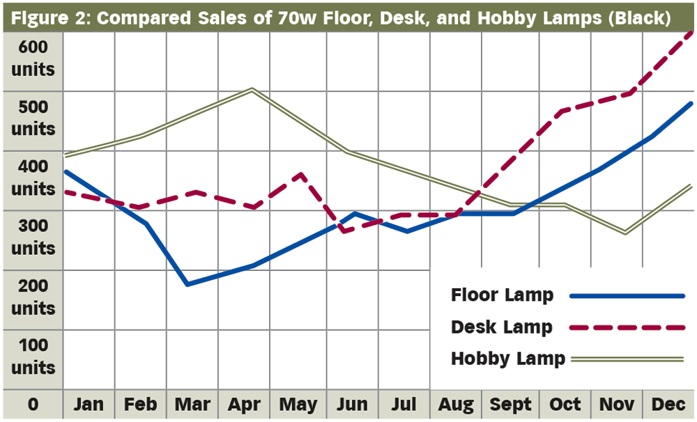
Use a line graph.
Create a line graph to show relationships between numbers—differences, proportions, or trends. A line graph shows changes in quantity over time.
-
Typically, the horizontal axis measures time (days, months, years), and the vertical axis measures a quantity (costs, products sold).
-
The quantity for each time period creates a “data point.” When joined, these points create the lines that show the trends.
Problem:
I don’t know how to make a line graph.
Listen for
Solution:
Follow these tips for creating a line graph.
-
Start the vertical axis at zero. If it’s impractical to show all increments, show a break on the axis.
-
Use all available data points (no skipping). Make sure vertical and horizontal units match well (roughly equal in scale or ratio).
-
Identify each axis. Label units measured (years, dollars), and use consistent increments. Print all words horizontally, if possible.
-
Vary data lines. Make data lines heavy, axis lines light, and background graph lines even lighter. Use patterns or colors to distinguish multiple lines.
-
Build a legend if necessary.
Sample Line Graph
-
Make data lines heavy and distinct.
-
Make axis increments consistent.
-
Label units.
-
Start the axis at zero.
-
Use a legend if necessary.
Problem:
I need to compare different amounts.
Listen for
“Which sells better?”
Solution:
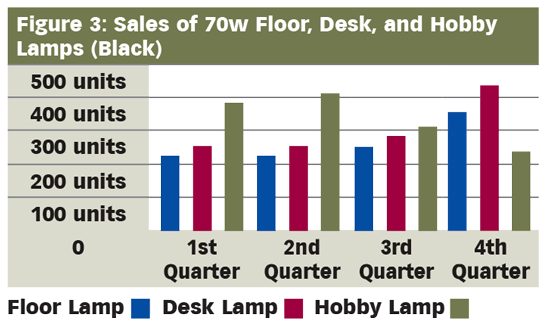
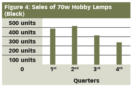
Use bar graphs.
Create a bar graph to compare amounts using a series of vertical or horizontal bars. The height or length of each bar represents a quantity at a specific time or in a particular place. Here are the types.
-
Single-bar graphs show quantity differences for one item.
-
Bilateral-bar graphs show amounts both above and below a zero line.
-
Segmented-bar graphs divide bars to show what parts make up their wholes.
-
Multiple-bar graphs present groups of bars so that readers can (1) compare bars within each group and (2) compare one group to the next.
Problem:
I don’t know how to make a bar graph.
Solution:
Follow these tips for making a bar graph.
-
Develop bars that are accurate and informative.
-
Choose a scale that doesn’t exaggerate or minimize differences between bars.
-
Maintain a consistent bar width and spacing between bars.
-
Use two-dimensional bars; 3-D bars can blur differences and amounts.
-
-
Design bar graphs that are easy to read.
-
Label bars and axis units clearly.
-
Add a legend if necessary.
-
Use patterns or colors to distinguish between different bars or segments.
-
Present items in a logical order within a group or within single-bar segments (ascending order, descending order).
-
Multiple and Single Bar Graph
-
Limit to five the number of bars in a group, or the number of segments in a single bar.
-
Keep words and numbers horizontal.
Problem:
I need to compare parts of a whole.
Listen for
“Show a budget breakdown.”
“How do the parts compare?”
Solution:
Use a pie graph.
Create pie or circle graphs to divide a whole quantity into parts. These graphs show how individual parts relate to the whole and to each other. Use pie graphs to
-
show proportions.
-
give the big picture.
-
add visual impact.
Problem:
I don’t know how to make a pie graph.
Solution:
Use these tips to create a pie graph.
-
Keep your graph simple. Divide the circle into six slices or fewer. If necessary, combine smaller slices into a “miscellaneous” category, and explain its contents in a note or in the text.
-
Make your graph clear and realistic. Avoid confusion and distortion.
-
Use a moderate-sized circle and avoid 3-D effects.
-
Distinguish between slices with shading, patterns, or colors.
-
Use a legend if necessary.
-
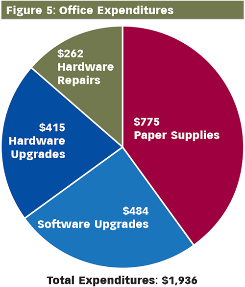
Measure slices (number of degrees) to assure accuracy. Use graphics software or the formula below.
-
To Calculate Degrees for Each Slice:
Amount of part ÷ Amount of whole × 100 = Percentage of part × 3.6 = Degrees for part
| Slices | $1,936 | 100% | 360 degrees |
| Part 1 | $775 | 40% | 144.1 degrees |
| Part 2 | $484 | 25% | 90.0 degrees |
| Part 3 | $415 | 21.4% | 77.2 degrees |
| Part 4 | $262 | 13.5% | 48.7 degrees |
Sample Pie Graph
-
Start at the 12:00 o’clock position with the largest slice and move clockwise.
-
Follow with the next slices in descending order.
-
Label each slice horizontally and indicate actual percentages and or/ amounts.
Problem:
I need to show data about different regions.
Listen for
“Show the breakdown by state.”
Solution:
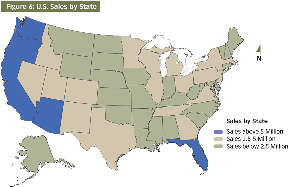
Use a map.
Create a map to present a wide range of useful information: communication and transportation data, distances, directions, regions and zones, natural and urban features, market segments, and so on.
Problem:
I don’t know how to create a map.
Solution:
Use these tips to create a map.
-
Make the geographic area clear. While your map need not be geographically accurate to be highly effective, it should clarify the area in question. Orient the reader by providing a directional arrow (usually north).
-
Provide useful content. Select details carefully, making sure that features, markings, and symbols are distinct and easy to understand. If necessary, use labels and a legend. Add a note or caption to help the reader interpret the map.
-
Indicate differences for regions by
-
coloring, shading, cross-hatching, or dotting.
-
creating bar or pie graphs in each area on the map.
-
labeling areas with actual numbers.
-
Note: Search online for interactive mapping programs, such as the National Geographic MapMaker.
Sample Map
-
Make the actual geographic area clear.
-
Indicate differences by using color, shading, or a pattern.
Problem:
I need a really clear picture of an object.
Listen for
“Show me all the parts.”
Solution:
Use a line drawing.
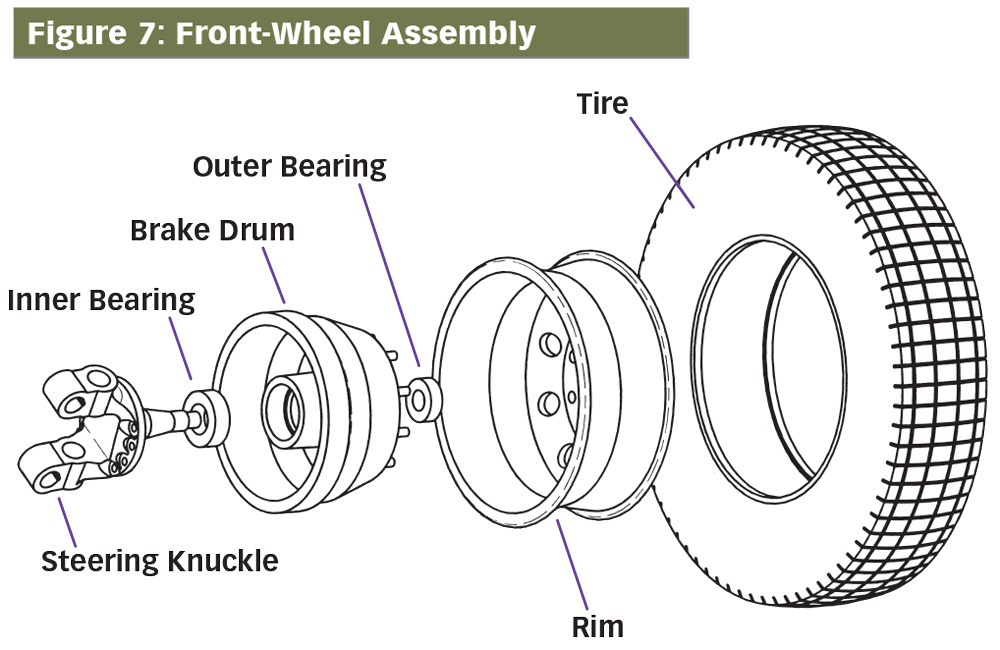
Create a line drawing to screen out unnecessary details and provide clear, simplified images of objects. Different types of line drawings focus on different key features.
-
Surface drawings present objects as they appear externally.
-
Cutaway drawings or cross sections show an object’s inside parts.
-
Exploded drawings “pull apart” an object, showing what individual parts look like and how they fit together.
Problem:
I don’t know how to create a line drawing.
Listen for
Solution:
Follow these tips for line drawings.
-
Use the right tools. Use drawing instruments or a CAD (computer-aided design) program. Get expert help if necessary.
-
Select the viewpoint and angle needed to show key details: surface, cutaway, or exploded; front, side, diagonal, back, top, or bottom.
-
Pay attention to scale and proportion to represent the object accurately.
-
Include the right level of detail (for the reader). Avoid clutter, and use colors to highlight and clarify information.
-
Use labels, or “callouts,” to identify key parts of the object.
Sample Exploded Drawing
-
Use labels or callouts.
-
Represent proportions of objects accurately.
Problem:
I need to show how something really looks.
Listen for
“Let me see it.”
Solution:
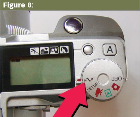
Use a photograph.
Use photographs and other visual images to provide detail. Traditional photographs, black-and-white or color, show the surface appearance of reality—from people to things to landscapes.
The very latest photographic technologies can be used to show external and internal images of a different nature: infrared pictures, x-rays, ultrasounds, CAT scans, 2-D and 3-D computer-generated images, and so on.
Problem:
I’m not great with using photos.
Solution:
Follow these tips for using photos.
-
Be creative and ethical. Software such as Adobe Photoshop and Paint Shop Pro allows you to modify images, but make reasonable changes that do not distort or distract.
-
Removing blemishes and cropping images is standard practice.
-
Adding, subtracting, and distorting should be avoided or well documented.
-
-
Take, develop, and print quality images.
-
Use good equipment or seek expert help, if needed.
-
Select distances and angles to clarify size and details.
-
Enlarge and crop images to focus on key objects.
-
Place images on the page or import them digitally into documents.
-
-
Obtain permission to use any recognizable photo of a person or place.
-
Clarify images. Use labels, arrows, size references, and so on to help the reader get an accurate picture.
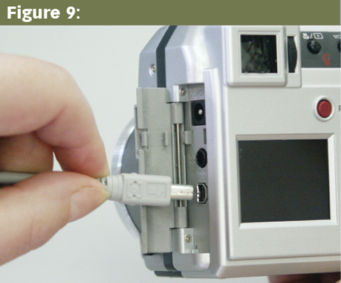
Sample Photographs
-
Indicate a specific portion of an image with an arrow.
-
Consider including a hand or ruler as a size reference.
Checklist Design
Your goal is to create a design that uses graphics to communicate your message in the clearest, most compelling way.
-
Is my page layout balanced?
-
Have I used headings to break up text?
-
Do I use lists to help make points clear?
-
Do I effectively use white space (margins, space between paragraphs)?
-
Have I selected a readable typeface for the text?
-
Have I selected an appropriate page design?
-
Have I followed good page-layout principles?
-
Do I use tables to present raw data?
-
Do I use line graphs to show changes over time?
-
Do I use bar graphs to compare quantities over time?
-
Do I use pie graphs to compare quantities at one time?
-
Have I included appropriate maps?
-
Have I included helpful line drawings?
-
Have I provided photographs as needed?
“Design is not just what it looks like and feels like. Design is how it works.”
—Steve Jobs